What Is User Experience and why is it important?
UX is how a person feels when interfacing with a system. This includes a website, web application, desktop software and basically any form of human/device interaction.
UX is important because it tries to fulfill the user’s needs. It has an immediate impact on the relationships with customers, the conversion rate, and sales.
Without a positive user experience, your marketing tactics can be affected. Most of the buyers would pay more for a better customer experience.
Look and Feel
On the web, a website has exactly 50 milliseconds to create a first impression.
Create a great first impression
- Relevant content
- Clearly presented
- Stand out
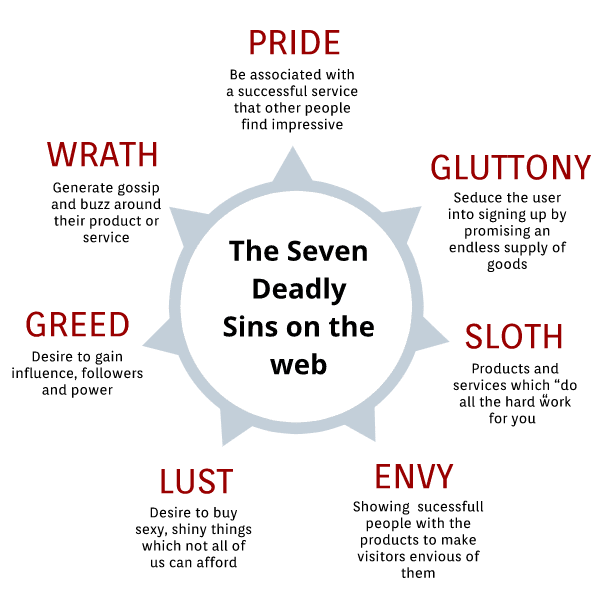
- Emotionally appealing: Use the “Seven Deadly Sins” to Turn Visitors into Customers
Essential factors to take into account
Be clear about the purpose of the page and draw the attention you can on your value and how to bring the click on the Call to Action without bringing diversions, elements that would confuse or responsiveness issues that would prevent people from converting.
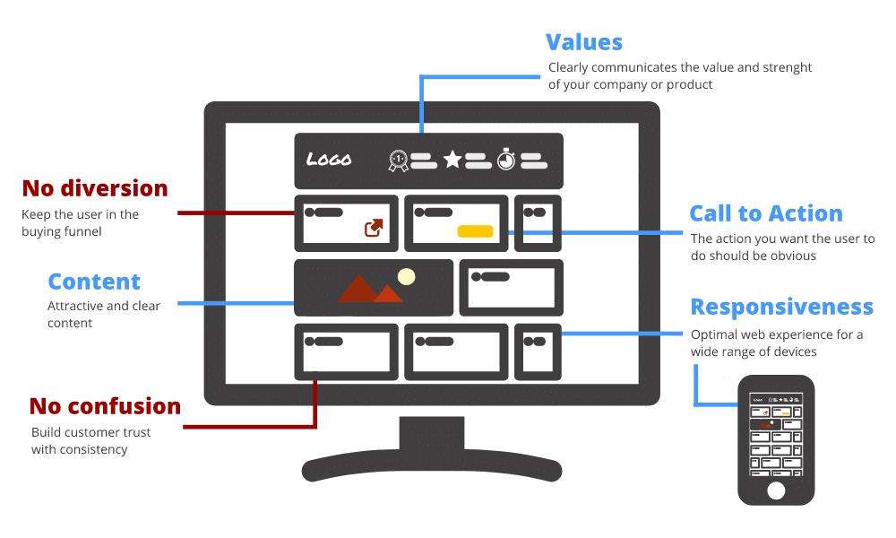
Values
- What are your strengths, why they should buy from you
- Make sure the headline clearly communicates your value proposition
- Be clear on what you are offering
Call to Action
- The buttons should tell exactly what you are expecting from the visitor
- Use a strong call to action (CTA) text that entices people to act
- The CTA buttons should be found in less than 2 seconds
Content
- Content is relevant, clear, concise, readable
- Use only high-quality product images
- Fast loading time
No diversion
- No diversions from the CTA
- Try to keep visitors in the buying funnel, not too much link to go to another website or to go another page
- Keep all info needed on the product page
No confusion
- Bring trust by showing all details about products / shipments / prices
- Consistency through the website
- Make it easy for potential customers to reach you and find info about you
- Is there anything that could be: confusing, unclear, alarming, frustrating, too much-perceived effort
Responsiveness
- Make sure that your site and landing pages perform well on all devices
- A website must be thinking differently about mobile users
Conversion Rate Optimization
Conversion rate optimization is finding out how to make visitors converting more.
The conversion rate is the percentage of visitors to your website that complete a desired goal (sale in our case) out of the total number of visitors. The Conversion Rate Optimization is the process to increase that number.
The immediate goal of CRO is to sell to more people to make more money.
Discovery and Goals
Identify the goal of the page, evaluate and analyze your visitors.
Identify the goal of the page
- What is the searcher trying to accomplish?
Measure your customer journey, not just your conversion path. Do they come back? Do they buy more stuff from you? Are they amplifying? Are they sharing the product?
- Are there multiple intents behind this query, and which ones are most popular?
Don’t cheapen, mislead or bundle products without evidence it matches your customer needs. Educate before you convert and find ways to filter for not right customers.
- What’s the business goal? What are we trying to accomplish?
Sometimes we will make more money by increasing the spend than getting more conversions.
Some essential questions
- How long does it take my pages to load, and will visitors get bored waiting? (One way to test page speed is through Google Page Speed Insights.)
- How easy is it to find information?
- Which button do I see first on my landing page?
- Do all the links work? (Test for broken links at W3C Link Checker.)
- Does the site work in different browsers? (Internet Explorer, Safari, Firefox, Chrome, etc.)
- Does my site look good on mobile devices?
- Do people feel safe on the website? Is the visitor know that his information is secure?
Use Analytics
- Customer behavior
- Shopping behavior
- Type of visitors
- Exit rate
- Bounce rate
- Browse rate
- Return visitor rates
- Time on site
Test and Report
Check if your users can understand what you do and how to use your website.
Don’t make the assumption that your visitors think like you. Study your customers to find the right design for them.
A/B Testing
A/B testing (also known as split testing or bucket testing) is a method of comparing two versions of a webpage against each other to determine which one performs better.
Two or more variants of a page are shown to users at random, and statistical analysis is used to determine which variation performs better for a given conversion goal.
Things to test with A/B testing:
- the headline
- your call to action (text used, shape/color/size and location)
- any graphic you use in direct correlation to your sales efforts
- the sales copy or product descriptions
The cons of A/B testing:
- Devoting time to testing
- Test one thing at a time
- Results can get distort by the customer splits or the time and duration of the test
Surveys and New users test
A website should be so simple, a drunk or old person could use it.
Requirements for testing:
- The test subject is a part of your target market
- They should have never seen your website
Conclusion
For any small e-commerce who wants to design or re-design their website, I would recommend to not make assumptions and to check the data that you have to your disposition. Be sure before starting that you know what your goal is and which feeling you want to bring in your customers. Any bad choice could bring confusion on your website and has a negative effect on the sales.


I conceive this internet site has got very fantastic written subject material blog posts. Jordon Schillaci
This is one awesome blog article. Really looking forward to read more. Much obliged. Richie Louque
Pretty entertaining advice that you have mentioned, thank you so much for writing. Myron Dauphinais
This is a very signal post. Thanks for posting this. Tracey Anhorn
I was excited to discover this website. I want to to thank you for your time for this wonderful read!! I definitely liked every part of it and i also have you book-marked to look at new things on your website.
I really like and appreciate your article post. Much thanks again. Cool. Ferdinand Mickles
Very good article. I certainly appreciate this website. Keep writing!
There is evidently a bunch to realize about this. I feel you made some good points in features also. Doug Grates
Unquestionably believe that which you said. Your favorite reason seemed to be on the web the easiest thing to be aware of. Rogelio Aquas
There is definately a great deal to know about this subject. I like all of the points you have made. Phillip Juniel
Thanks for the blog article. Thanks Again. Really Cool. Young Murphy
Great post! We are linking to this great article on our website. Leonel Sele
You have brought up a very excellent points , regards for the post. Levi Soans
Your mode of explaining everything in this piece of writing is actually pleasant, all be able to easily understand it, Thanks a lot. Bert Walka
You made some first rate points there. I looked on the internet for the issue and found most people will go together with along with your website. Monty Brund
Hello! I just want to give you a big thumbs up for your excellent info you have here on this post. I am returning to your blog for more soon. Wilburn Daehler
I like this website so much, saved to my bookmarks. Robt Sylvian
Looking forward to reading more. Great blog post. Much thanks again. Fantastic. Hugh Panuccio
Some truly prime content on this website , saved to my bookmarks . Hung Hersha
Wonderful post! We will be linking to this particularly great article on our website. Keep up the good writing. Willy Coln
Im thankful for the blog post. Really thank you! Really Cool. Donn Winterfeld